UI/UX DESIGNER
A gym discovery app designed for easy browsing and a seamless discovery-to-subscription experience.
July 2025 - Oct 2025
5 Minute Read

Project overview
Gym Hub is a mobile platform that helps users discover gyms, compare membership options, subscribe, and manage their training experience in one place.
How the Product Works
Discover
Users explore gyms, compare plans, and review facilities and ratings before committing.
Subscribe
Users select a membership duration, review included benefits, and subscribe directly in the app.
Train & Track
After subscribing, users manage their membership, track workouts, and monitor progress from a single home screen.
The Problems
Post-Subscription Mismatch
After subscribing, the app continued to prioritize gym discovery instead of membership management and workout tracking, creating friction in post-purchase use.
Unclear Subscription Value
Differences in price and benefits across subscription durations were not clearly communicated, increasing cognitive load and uncertainty at checkout.
Design Process
I designed Gym Hub by defining a clear goal for each feature and validating every screen against that goal to minimize friction and unnecessary complexity.
Feature Level
the Primary action the user should take.
What success looks like for that interaction?
Page Level
Each screen was evaluated against a single question:
Screens that introduced unnecessary steps, unclear hierarchy, or competing actions were reworked or removed.
Iteration & Refinement
I iterated on layouts and flows to reduce the number of steps, clarify decision-making, and strengthen visual hierarchy—prioritizing clarity over feature density.
The Solutions
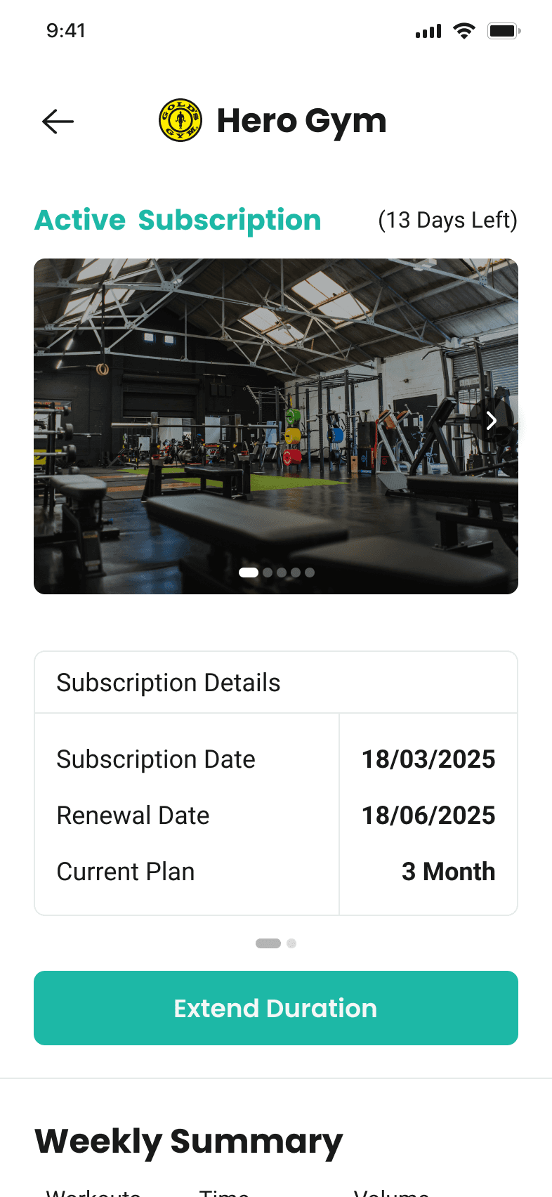
Home Screen Reprioritization
Shifted the home experience from gym discovery to membership ownership by prioritizing active workouts and performance insights immediately after subscription.


Instant Plan Breakdown
Designed the details page to dynamically update pricing and included benefits based on selected duration, helping users compare value instantly.

Design Impact (pre-launch)
Reduced workout access friction from 4–5 steps to 1 tap to start a session, and 2 taps to open the full program.
Shifted the home experience from gym discovery to active membership ownership.
Made subscription value instantly clear through dynamic pricing and benefit updates.
Increased post-subscription clarity by keeping status, progress, and program access visible at all times.


What I’d Measure After Launch
How quickly users start their first workout after subscribing
Where users drop off during subscription selection
Usage of workout tracking compared to gym discovery post-subscription
Support request related to plan and benefits confustion
What I’ve Learned
Post-subscription needs require a different experience than pre-purchase discovery.
Clear value comparison outperforms descriptive explanations during decision-making
Fewer steps lead to stronger user confidence and task completion.
Strong UX decisions often come from removing steps rather than adding guidance.