UI/UX DESIGNER
A minimal skincare app designed for calm browsing, frictionless checkout, and clear order feedback.
Feb 2026 - Mar 2026
3 Minute Read

Design Process
Asset Creation
Generated product photography using AI with consistent brand guidelines — same color, same packaging style, transparent backgrounds. This ensured visual cohesion across all product cards without relying on stock photography.
Lo-fi wireframes
Mapped all screens and user flows before going high fidelity. Key structural decisions were made at this stage — screen count, navigation model, and information hierarchy per screen.
High Fidelity & Decision Making
Built screens iteratively in Figma, making UX decisions as real constraints emerged — the no onboarding decision, skeleton loading states, accordion product details, empty cart recovery, and dynamic payment button were all resolved during this phase.
Interactions & Micro Animations
Prototyped key interactions in Figma — filter loading flow, add to cart transformation, payment method switching, and order status progression. Interactions were treated as part of the design, not an afterthought.
Design System Documentation
Documented colors, typography, spacing, border radius, shadows, and components after screens were complete — reflecting how the system actually emerged from the design rather than being imposed before it.
Designing a Calmer Shopping Experience
Most e-commerce experiences overwhelm users with excessive promotions, dense layouts, and unnecessary onboarding flows.
Zain was designed to reduce friction from the first interaction by prioritizing immediate product discovery, intuitive navigation navigation, and a visually calm interface.
Instead of introducing the app through tutorials, the experience introduces itself through the interface itself.

Simplifying product discovery
Designed for fast scanning and calm exploration — skeleton loading states keep the interface stable during filtering, and clear hierarchy reduces decision fatigue.
Reducing friction during checkout
Streamlined the checkout into a single scroll with dynamic payment feedback — extended post-purchase with progressive order tracking that reduces uncertainty after buying.

From cart to confirmed
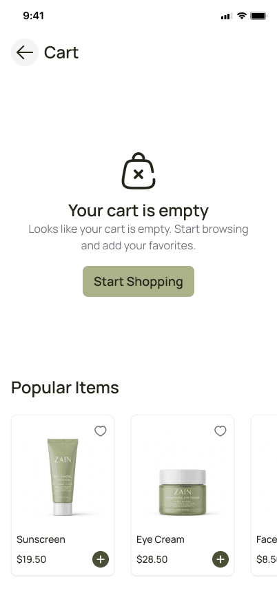
a linear checkout flow with no dead ends. Empty states recover abandoned sessions, payment switching happens inline, and order tracking begins immediately after purchase.
What I’d Measure After Launch
Zain was designed around reducing friction and building trust — these are the metrics that would validate whether those decisions actually worked.
Add to cart rate, sinch it signals issues with product presentation or pricing calrity
Checkout completion rate, drops here point to friction in payment or trust around COD
Empty cart recovery rate, how often a dead end turns into a discovery moment via Popular Items
Return visit rate, signals trust and brand affinity over time
Time on product page, too short suggests low engagement, too long may signal confusion
What I’ve Learned
Building Zain end-to-end sharpened how I think about product decisions — not just visual ones.
Restraint is a design decision. Simplicity isn't the absence of decisions, it's the result of them
Interactions belong in the design phase, not after. Designing them early shaped layout and component structure from the start
A design system emerges from the product. Documenting it after the screens were built revealed patterns I wouldn't have noticed upfront
Copy is part of the design. The payment button, order status, and empty cart message all needed deliberate writing decisions